Showing posts with label website. Show all posts

Sunday, April 3, 2016

How To Avoid SEO Ranking Traps Before Re-designing a Website?

When it comes to creating a website, one of the first questions you should ask yourself is, “Should I focus on a fantastic design and user experience or on search engine optimization?”
Today, websites are marketing hubs and content publishing platforms. The problem is that the web design industry still creates websites as if they were digital brochures. Designers should work together with SEO specialists and developers to find a formula that would meet both the preferences of users and the requirements of search engines.

Moreover, the bridge between Design and SEO has a common trap that we need to avoid: SEO-friendly sites that are going through a big re-design requires careful monitoring, as the impending design can hurt the site’s SEO.

What are such design errors from web designers?

ERROR #1 – Splash Pages
Eye-catching splash screens can be a cool addition to your site but it can actually be a barrier between search engines and your website. Flash, Java applets, and all the non-textual content is often devalued or even ignored by search engine spiders. A homepage with no content and navigation will not be favored by search engines because it causes an improper indexation of the entire site.

It is recommended that you either entirely abandon the inclusion of a splash page or, if it is an absolute must-have, add plenty of textual content to the body of the page.

ERROR #2 – Too Much Flash
Though undoubtedly pleasing to the eyes, Flash is still badly indexed by search engines. Doesn’t mean that your site should contain zero Flash though; just avoid applying it for important content and navigation.

ERROR #3 – Frames
Paradoxically, there are still websites designed with the use of frames. In addition to the fact that they have become obsolete years ago, they also will not offer any help with the betterment of your site’s SEO. The use of frames will make it difficult for search engines to find all the valuable content within your site. Note that framed websites use three html files instead of one, causing all kinds of conflicts with indexation.

ERROR #4 – Images Instead of Important Elements
Using images as a primary form of navigation will be identified by search engines without their functional purpose. On the other hand, navigation through pure text isn’t a good practice as well. The solution? Simple. Use text-over-image techniques with CSS.

It is also not recommended to include images when using headers. Content replaced by beautiful graphics with text may look outstanding, but it will not work for SEO. Because header text is meant to highlight the important keywords, opting for images as an alternative will hurt overall content.


ERROR #5 – Lack of Breadcrumbs
Breadcrumb trail matrix that’s perfectly constructed will significantly increase your site’s search engine performance. Not only are text links easily read by search engines, but they also provide a transparent hierarchical navigation structure.

Unfortunately, designers sometimes forget about breadcrumbs despite the fact that they noticeably increase the user friendliness of a website.
 
ERROR #6 – Pop-Ups
To begin with, designers that include pop-ups are regarded in bad taste not just by their fellow designers, but also by visitors and search engines. They are annoying and usually closed by most users the moment they… pop up. Moreover, they immediately evoke prejudice about the website and search engines do not even index them as a part of the website. With that, it can be said that it’s best to forget about pop-ups forever for everybody’s sake.

ERROR #7 – Neglecting the navigation standards
There are probably a few designers out there who believe that creating a totally weird site with no regular navigation elements or footer links would attract users and seem original and unique to everyone. This is unfortunate. A navigation that is properly organized is essential both for visitors and search engines.

Creative art, if not applied properly, will be treated like a poor internal linking structure, harming your rankings and reputation. The global navigation bar must be present on each page; otherwise users might get lost within the website.

ERROR #8 – Improper 404 Error Page
Creating a custom 404 error page is always a cute way of sneaking in a bit of humor within your website. However, this intention for creativity might lead to the neglect of more essential factors, such as the link to return to the website.

Not only will it improve the user experience, but it will also complement the overall SEO value. Otherwise, search engines will identify your website as one with broken internal links, reducing its search rankings as a result.

Putting The “Design” Part Of Web Design Into Perspective
Managing the balance between design and search engine optimization is the key to a successful inbound marketing strategy. Seth Godin sums it up a post where he says that pretty websites rarely convert as well as unpretty ones.

As with any new project, you should always focus on getting the foundation right. Here are some thoughts to get your website re-design project off on the right foot: Best-selling author Ann Handley says that you should get the content people in the room early, rather than trying to shoe-horn content in after the fact.

Content is what drives SEO these days, not back links. Your website needs to be structured as a content publishing platform and as the hub of your marketing efforts. Keep in mind that people come to your website for its content, not for its design.

Remember that there is no perfect web design. In fact, there are an infinite number design styles your site can have and still get the same results as long as the design is professional and SEO friendly.

Focus on the website re-design to make your website look clean, attractive and easy to navigate.
Your new site must include a content management system (CMS). WordPress is the best CMS on the planet and there are many reasons why WordPress is the best CMS for small businessesLaunching a new website is just the beginning. You will need to feed it with great content all the time for it to grow and work for you.

The reason why many website re-designs fail is simply because content and SEO are addressed after the fact. There is nothing more discouraging for a business than when a new website loses valuable Google rankings, or when a company finds out they have to go back to the drawing board make a new site search engine friendly.

How To Avoid The New Website Ranking Blues

1. Keyword research will help you determine content and pages, thus, will impact site navigation, content and page count. Keyword research isnot as hard as it sounds. Yet, almost no one considers keyword research when drafting website content.

For basic keyword research, you can use a free tool within Google AdWords called the Keyword Planner to search for specific keywords that are being searched in your niche. The great thing about this tool is that you are not only able to find the words most searched, but also how much commercial competition there is for each word. With this data, you can develop a list of words to include in your website copy and content marketing plans.

2.
The content people need to know what to write about.
Once you do the content research, you have to get it to the “write” people – as in the content writers. It’s important that they understand the goal of weaving your keyword targets into the copy while delivering your own messaging. It’s not that you want to write for Google or the search engines – that is a terrible idea. It’s just that you do want to forget about the search engines when you are writing or structuring your website.

3. SEO coding best practices should be addressed by designers and developers early on.
After your keyword research is done, you’ll need to pay close attention to SEO coding best practices to make sure the re-design is optimized from the first line of website code. Moz has an awesome resource for this called the Web Developer’s SEO Cheat Sheet. This is extremely important and should be addressed early on.

4. Website layout and page elements, such as content placement above the fold and elsewhere are important for SEO and for conversion optimization. We’ve talked about including the right words, writing the right kind of copy and using the best code, but you also need to consider how much content to include and where it should be placed.

For example, the content at the top of your page has more search engine weight than the content at the bottom. Also, a page with 100 words of content is less likely to rank than one with 500 or 2500 words of quality content.

You want to make sure that the message and goal for each website page is clear at the top of the page, and that a call to action or purpose for each web page is clearly defined.

5. Other content besides text copy should be included on your website.
Rich media on your website not only helps for search engine optimization, but also for conversion optimization. Consider embedding videos from YouTube, embedded podcasts, downloadable PDFs and of course images.

Each one of these pages element can be tagged with structured data for SEO to give the search engines context to these page elements.

Friday, March 25, 2016

What Web Design Trends Are You Most Excited About in 2016?

Recently, I’ve seen a surge in popularity of responsive web design, what impressed me most is that web design is a quickly moving and changing industry where trends come and go quite often. Probably we’re still working with some of those trends now: responsive web design, flat design, performance and speed, and perfecting the user experience. However, what are some of the new and emerging trends of web design we expect to see in 2016?

More Card-Style Interfaces
Website card layouts were first popularized by Pinterest a few years back and have since become a trend for content-heavy webpages. Free plugins like jQuery Masonry can be used to mimic this layout style with animated cards for various heights & widths.
 
A card layout is best used on pages with lots of data that should be scannable. The landing page for Google Now uses a card layout to advertise optional cards for the Google Now App.

You can think of card layouts as more dynamic grids with a focus on minimizing content to the bare essentials to list more items together. Online magazines like UGSMAG and The Next Web are both perfect examples of card layouts used to showcase recent post content.

More Imagery, Less Text
Consumers tend to look more at pictures and video and less at the text. This creates a balancing act between SEO and UX. Search engines prefer text they can index. This will move text-rich content to sub-pages and the image-rich content to the homepage. If text is required for the homepage, try to place it under the imagery. Target the users first and the search engines second.
Browsers are becoming faster at rendering images. This means images can be larger with higher resolutions than before. Expect a greater emphasis on higher quality images and artwork.

To scroll or not to scroll
Have we reached the point where scrolling increases readership, but we want less scrolling? Possibly. For 2016, I anticipate some sites going with minimal scrolling while others embracing the long scroll.
There’s benefits and drawbacks to both: long scrolling feels natural and is easier than clicking but it spaces out content and makes it harder to scan to find info while shorter scroll gets to the point quickly but it may be so quick that causes bounce rates to increase.

Above, Uppercase has opted to go with a no-scroll site. What you see in the screenshot is what their site currently loads. All of what you need is right there without needing to scroll further. It will be interesting to see the scrolling battle play out in 2016 and which one comes out on top. Currently, there are more long scrolling sites than shorter scrolling sites, but only time will tell which is truly the best way to consume content.

Vibrant Custom Illustrations and Iconography
High pixel density monitors have revealed how standard image formats don't always work as expected on the modern web. Using .jpg and .png files can result in a pixelated look on retina displays, which spoils the aesthetics of a website.
Today, wider browser support for Scalable Vector Graphics (SVG) and easily implemented icon fonts are a fantastic answer to this problem. As a consequence, we’ll see more web designs showcasing colorful custom illustrations, as well as stylish hand-drawn icon fonts and SVG icons that remain crisp and beautiful at any screen resolution.

Interactive Immersive Experiences
As humans, we’re storytellers and lovers of good stories by nature. Thanks to the magic of HTML5 canvasCSS3 transitions and animations, state of the art JavaScript APIs like WebGL and Greensock, as well as the power of hardware acceleration, storytelling on the web will be even more immersive and interactive.
Browsing the web on mobile devices has made users more accustomed tolong scrolls. Website designs that are capable of telling a great story keep users engaged with the content and entice them to keep scrolling to the bottom of the page.

HD Visual Assets
Increased bandwidth, wide browser support of HTML5 video, and ways to serve high resolution graphical assets selectively to devices with retina screens, all add to the popularity of gorgeous HD background images andvideos on websites growing even stronger in 2016.
Wider browser support for CSS3 background blending can very well lead to the application of dramatic artistic effects on images, which are created directly in the browser with a few lines of CSS code.

Collaboration Tools for Design
Instant messaging and group chat has been around for well over a decade. However these resources have traditionally relied on plaintext with some capability to attach files.
A new emerging trend is the ability to share live design documents within chat applications. Notable is one example where annotations and comments can be layered right on top of a document. This gives designers a clean way to share work directly with everyone on a team.

Slack is the most popular chat application at the moment which supports many similar features. The growing Slack userbase has been adamant about creating extensions that greatly improve Slack’s capabilities & tie into other products like Hangouts, MailChimp, and even WordPress.

Vertical Patterns and Scrolling
A bigger leaning toward mobile – with some thinking mobile traffic could equal desktop traffic this year – means more sites are being designed with vertical user flows.
A few years ago, we were all debating the end of the scroll in web design only to find it roaring back as an important interaction tool. Smaller screens lead users to scroll more and designers to create user interfaces that are much more vertical in nature.

More Beautiful Typography
Streamlined interfaces have paved the way for the emergence of beautiful typography. (As has the addition of more usable web type tools such as Google Fonts and Adobe Typekit as mainstream options for creating expansive type libraries online.)
Big, bold typefaces will continue to rule because they work well with other trendy elements. This simple concept of lettering gives more room to other elements, while communicating the message with a highly readable display. The must-try trick is a simple pairing of a readable typeface and fun novelty option.

Illustrations and Sketches
Illustrations and sketches bring a fun element of whimsy to a site design. They can work for sites of all types and aren’t just for children anymore. The illustration style has also started to grow in popularity when it comes to some of the smaller pieces of website design as well, such as icons and other user interface elements. What’s nice about this trend is that illustrations make a site feel a little more personal. Because an illustration or sketch style icon appears to be hand-drawn, it looks and feels personal for users. That can go a long way into creating a connection with them.

Reality-Imagination Blur
Is that site real or animated? Is the path predetermined or can I make choices along the way? The next step of gamification and design is emerging with a blurred line between what’s real and what’s created (or imaginary) in web design projects. And the results are pretty stunning.
From virtual reality to websites that let you make choices to find new content, this type of customization is personal and users seem to really like it. This trend also includes creating imagery that looks real, but you know that it is not.

Final Thoughts
Looking through the examples above, these are just a few of the web design trends that will become more prominent throughout 2016. You may see it’s a combination (and culmination) of multiple trends from the past few years, and many of these sites use multiple trending elements from this list to create interactive and engaging websites. So, what trends are you most excited about in 2016? Do you have any thoughts about responsive web design? Leave your comments below.

Monday, March 21, 2016

10 Tips to Boost Your SEO in 2016

According to hubspot.com, in the U.S. alone, an average of 12 billion web searches are conducted each month. SEO will gain importance more than anything else as it helps you drive quality traffic, get visibility, boost your brand and lend your business the credibility it needs to succeed. After all, what is the point of creating so much content and graphics if it is not visible to the audience when they run search query.
This year, search engine optimization will be as powerful as ever, but search engines are getting smarter — and it’s harder than ever to use dodgy tricks to fool them, so make sure that you have built your site in the right way and regularly posting quality content to drive a steady stream of traffic to your pages. Now let’s take a look at the best SEO trends and developments that are set to rock the world in the year ahead.

Providing High-quality Content
As we all know, content is the most important part of the site, and content marketing is any marketing that involves the creation and sharing of media and publishing content in order to acquire and retain customers. Accordingly, the goal of content marketing is to provide value to visitors.

If you want to create a great content marketing campaign you should focus on providing answers. Every word you write should have value and give answers to the questions your readers might have. Take a moment to search Google for something you find interesting. You will see that many of the articles on the first page are how-tos and list posts. There's a reason these posts get on the first page of Google: they provide value.

Social Content Will Gain Prominence
In the coming times, content from social media such as Facebook, Twitter and LinkedIn will gain more importance on the SERPs. Already, 76% marketers use Social Media to support and boost SEO, cites an article published at Impactbnd.com. In 2016, marketers will do everything possible to make their Facebook posts or tweets rank higher on the SERPs.

Isn’t that amazing?! We predict that more social media content will be indexed on Google and other popular search engines such as Bing and Yahoo. This will in turn blur the lines between ‘web’ and ‘social media’ in terms of SEO strategies. So, be prepared to find, collect and use your valuable social content for optimizing your page for maximum visibility.  For brand names, social media profiles are amongst the top results in search listings. For instance, if you search “Designhill” on Google, the company’s Facebook page, Twitter profile and the LinkedIn page appear as the top listings. See for yourself!

Blog.kissmetrics.com states that links to content on Facebook, Twitter, LinkedIn, Google+, YouTube and other social networks help the search engine crawlers understand what websites are credible and should be ranked for what keyword phrases.

Videos Will Still Rule
We all know that videos are a great way of keeping audience engaged and entertained. But do you know that by using enough videos, you can improve the ranking of your page on the SERPs. A report by Marketing Land states that videos make for 62% of all Google searches universally. Moreover, Google has started giving attention to blended results/searches. So, why not grab this opportunity to appear on the first page of search results by including an engaging video in your content? According to Quicksprout.com, videos get 50 times better organic page ranks in Google as against plain, static text results. Also, video searches garner 41% higher click-through rate as compared to plain, static text content, according to Relesoo.com.

Many marketers chose to drive their modern marketing engine with the fuel of Video SEO in 2015. And we predict that more marketers and businesses will embrace the trend of videos in the coming year too.

Now, the only way to appear in the search engine pages like this is by uploading your videos on You Tube or through video SEO. It is important that Google is able to find your video content, successfully index it and display your video content when specific keywords are entered as search terms.

Optimize the images on your site
Optimizing your images by compressing and resizing them may reduce the sizes of the images by a great extent, decreasing the page sizes and thus improving page loading performance on your blog. You may use online image resizing and compressing tools as well as their offline counterparts.

Make sure the images that you upload in WordPress are already optimized, but even if you don’t have already optimized images to upload, you can use a plugin like Smush.it to optimize and reduce the sizes of uploaded images automatically.

You can also add proper image tags to images in your posts to help them rank better in image searches. You can also include additional keywords through alt tags in your posts.

Voice Search Function a Must
These days, people who are on the go use voice search simply because it is more convenient and safer, especially when someone is driving or multi-tasking. It is becoming a huge part of mobile usage as it has taken away the pain of typing keywords to run a search query. Almost all mobile devices have a voice search functions. The popularity of voice searches has been spurred by Microsoft, Google, and Apple launching their own versions of advanced voice-responsive assistants – Cortana, Google Now and Siri.

Even ‘Domino’s Pizza’ has a ‘voice-ordering feature. However, make sure that your content is easily searchable through voice searches by using long-tail keywords, which are more likely to be spoken than conventional keywords.  Google Study finds voice search mostly used to ask for directions. For teens, doing a voice search while watching TV (59%) and while with friends (57%) are the highest use cases, according to marketingland.com. Whereas for adults, voice searching is done the most while watching TV (36%), followed by when with friends (24%) and while cooking (23%).

Content Aggregation will get Bigger & Better
According to Digitalcurrent.com, Knowledge Graph, wiki, local, maps, social media, news, images and videos make for 85% of Google search results. These stats indicates that now people look for sources that provide all relevant information for a particular subject or topic that at one place.

A blog published at imediaconnection.com explains that content aggregation is a practical way of finding, collating, amassing, consolidating, presenting, sharing, and displaying content around pre-specified set of criteria to appeal target audience. If you too are planning to do so, make sure that you collect and curate content from different, high-authority sources and display it at one place for your users to see to build your authority.

A great example of content curation is using the humble newsletter, Next Draft by Dave Pell, who has amassed over 160,000 subscribers to his daily email which shares the most interesting stories in business, culture, and tech, an article in Jeff Bullas explained. Another example is Inbound.org which was built by Moz and Hubspot to increase their reach even further.

Mobile-Friendly Is a Must
Since May 2015, mobile search has surpassed desktop search in ten countries, including the US and Japan, and it's a fact that this trend will continue. At this point, it’s a must for every webmaster to keep their website mobile-friendly.

Three tools that you can use to check whether your site is mobile-friendly are Bing's Mobile Friendliness Test Tool, Google's Mobile-Friendly Test, and mobiReady. The first and second are good, but they don't tell you why your site is mobile-friendly or not. mobiReady is a more sophisticated tool. I recommend using it because it gives you an enhanced view of your website analysis and uses a rating system. When your site scores higher, the more capable it will be of providing a quality user experience on mobile devices. Furthermore, it gives you a detailed list of website performance failures, and why some of these factors lower your page result.

In order for your website to perform well in mobile-friendly test tools, follow these tips:
l  Avoid software that is not common on mobile devices, especially Flash.
l  Remember to make your site responsive if you are coding it from scratch, or use a responsive framework/theme.
l  Be sure the content fits within the screen viewport so users don’t have to scroll horizontally or zoom.
l  Format text in a way that should be readable without zooming.
l  Place links far enough apart from each other so visitors can easily touch the correct one.

In case you are using a CMS for your website, check these guides provided by Google.

Don't forget: a mobile-friendly approach gives your site a great boost in Google's rankings. A non-mobile-friendly competitor doesn't stand a chance against a mobile-friendly site.

Keep Faster Loading Time on Your Site
Sites with a slow loading time don’t only annoy visitors — they also decrease SEO rankings. Top-ranking pages get loaded for about 1.1 sec, but on the other hand, 40% of people abandon a website that takes more than 3 seconds to load. Your site is probably between these two limits. Check these tools for analyzing your site's page speed and see what you can improve.

PageSpeed Insights is a tool offered by Google which helps to localize speed problems on your site. It has a ranking system from 0 to 100 where 100 is the highest score. The best feature of Google's PageSpeed is that it shows what needs to be critically fixed. It also shows other improvements you can make and how to fix them.

YSlow is an add-on for browsers that suggests ways to improve performance based on grades. Each component analysis has its grade. YSlow is great when you want to see the size of components according to their types. If you are serious about your website's performance, I recommend adding YSlow to your arsenal because it is based on rules created by Yahoo!'s Exceptional Performance team.

GTmetrix is another free tool that suggests ways to improve website speed. It's an efficient tool because it shows performance issues which are measured by both PageSpeed Insights and YSlow. It also displays a waterfall chart and three other charts measuring the performance of the website. For a more detailed waterfall analysis, Web Page Performance Test is another helpful tool.
To make your site load faster, there are many factors you should consider. Here are a few:
l  Use YUI Compressor compression to reduce the size of your CSS, HTML, and JavaScript files.
l  Be sure to reduce HTTP requests on your site. Also, reduce external files that need to be loaded such as style sheets, scripts and images.
l  Improve your server response time. This delay is usually caused by slow routing, lack of adequate memory or slow database queries.
l  Use browser caching so that when a user visits your site again, the browser doesn't have to reload the entire page, just some components.
l  When you optimize your images be sure to keep their size not too large or too small, and use the right format according to the purpose of your image. It is advised to use JPEG for photographs and PNG for graphics.

Don't Leave Behind Local SEO
This trend is only going stronger over the years. According to Entrepreneur.com, local SEO is likely to gain solid grounds in the coming days.

As a marketer, you have to let Google know where you are located and what you are offering so that your chances of showing up on pages, especially in front of the relevant audience, increase. It is must to have your local pages which will include the name of your business, address etc. with Google, Yahoo and Bing.

Since Google came out with its “Pigeon” update, local SEO has gained significant prominence forcing businesses and marketers to focus on a local tangent.  So, ensure of having location specific keywords and personalize content basis your target audiences’ location to stay ahead in the game in 2016. Check out some stats to know the benefits of ranking in local search results.
Local searches lead 50% of mobile visitors to visit stores within a day.
(Source: Searchengineland.com)
More than 60% consumers have used local information in ads.
(Source: Business2community.com)
50% mobile searches are conducted in hopes of finding local results.
(Source: Business2community.com)

Your listing in the local pages can increase consumer engagement with your business and your ranking. For instance, check out this example of three hospitals. The one that has the highest number of reviews ranks the highest. (Image source: Search Engine Journal)

Keywords Are Important, but Don't Try to Fool Google
 It's a long gone era when webmasters would try to "fool" Google with keywords. Now they must understand use keywords in the right context as much as possible.

Since the Google Hummingbird update, instead of chasing rankings for specific keywords in a question, it's better to figure out the context of a question. Answering questions is vital to any SEO strategy. Rather than focusing on a few phrases or keywords, brainstorm for conversation phrases people can use to look for your site.

A keyword strategy is still necessary. Here are some keyword research tools you will find useful: Google’s Keyword PlannerSEMrush and Ubersuggest. They will help you find popular keywords and phrases where you can create strategies around them. When you start planning a keyword strategy, keep an eye on Long-tail and LSI keywords.

Wednesday, March 16, 2016

10 Web Design Concepts That Will Make You Say "Amazing"

After reading the web design concepts of Hongkiat blog, I got a lot of insparation and plan to build my new WordPress themes. It’s really a crucial part of success of any website design when creating an effective and exciting experience. With HTML5 it is now possible to add dynamic interactions to websites and make them come alive. Now I just want to share my favorite 10 web design concepts of this year.

In this list you’ll see website designs that are out of the ordinary, almost wildly experimental. Some sites will take you through cinematic video experiences, others have 360ยบ views that allow interaction, and more come with amazing visual and sound effects triggered with clicks, drags and hovers, unusual navigation etc.

The hunt for the perfect house starts in your mind. This cool interactive website (with cool navigation) is aimed to take you through all needed steps to find a dream home. Start the experience by scrolling on your mouse.


2. VOID
VOID is a website created by Hi-ReS! agency as a playground for various visual experiments. Follow the instructions and get lost in the abyss.


Discover a story of Apatar, a legendary Gallic through six beautifully illustrated episodes. The website has great usability and a well integrated scrolling experience.


A stats page for Star Wars: Episode VII, this site is set to track the social footprint of the franchise. Click Use the Data Force to get started.


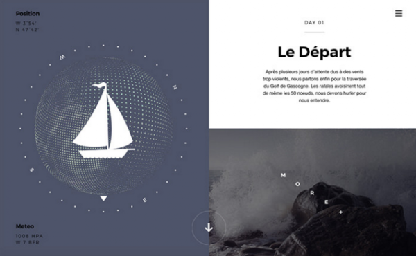
How do you tell the tale of a vivid sea voyage? Like this. You tell it like this. This amazing website shows a sailing trip experience from France to the Canary Islands.


This is a 360 interactive lookbook made by Lacoste in China. Discover yourself in a snow globe where time has stood still and see floating models in Lacoste outerwear collection.


This website shows how the British holiday has changed through a hundred years. It features unique old photos and facts about travelling.


Here is one more website dedicated to Star Wars. It collects Star Wars memories and you can share your own memories there. Try not to break the pew-pew buttons.


9. 30u
30u is a shoes collection website where you can pick your own style. You can change color combinations and the whole look of the shoes to choose what style fits your taste best.


10. Panic
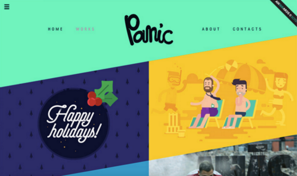
Panic, an animation studio in Latvia, shows their skills in motion graphics, 3d animation and graphic design which help them make amazing stories come alive. Check out their Works to get an idea of the possibilities.